NASA deploys multiple field campaigns to study Earth on all levels – air, sea and ground – collecting massive amounts of valuable raw data. While significant, processing this volume of information takes a lot of time, potentially hindering the overall pace of discovery and innovation.
With support from NASA’s Earth Science Technology Office, U of I Professor Larry Di Girolamo collaborated with NCSA’s Advanced Visualization Lab to address this challenge. The interdisciplinary team developed a prototype that transforms complex Earth data into a 3D video dashboard, making this information more accessible and readily available through NASA’s Open-Source Science Initiative.
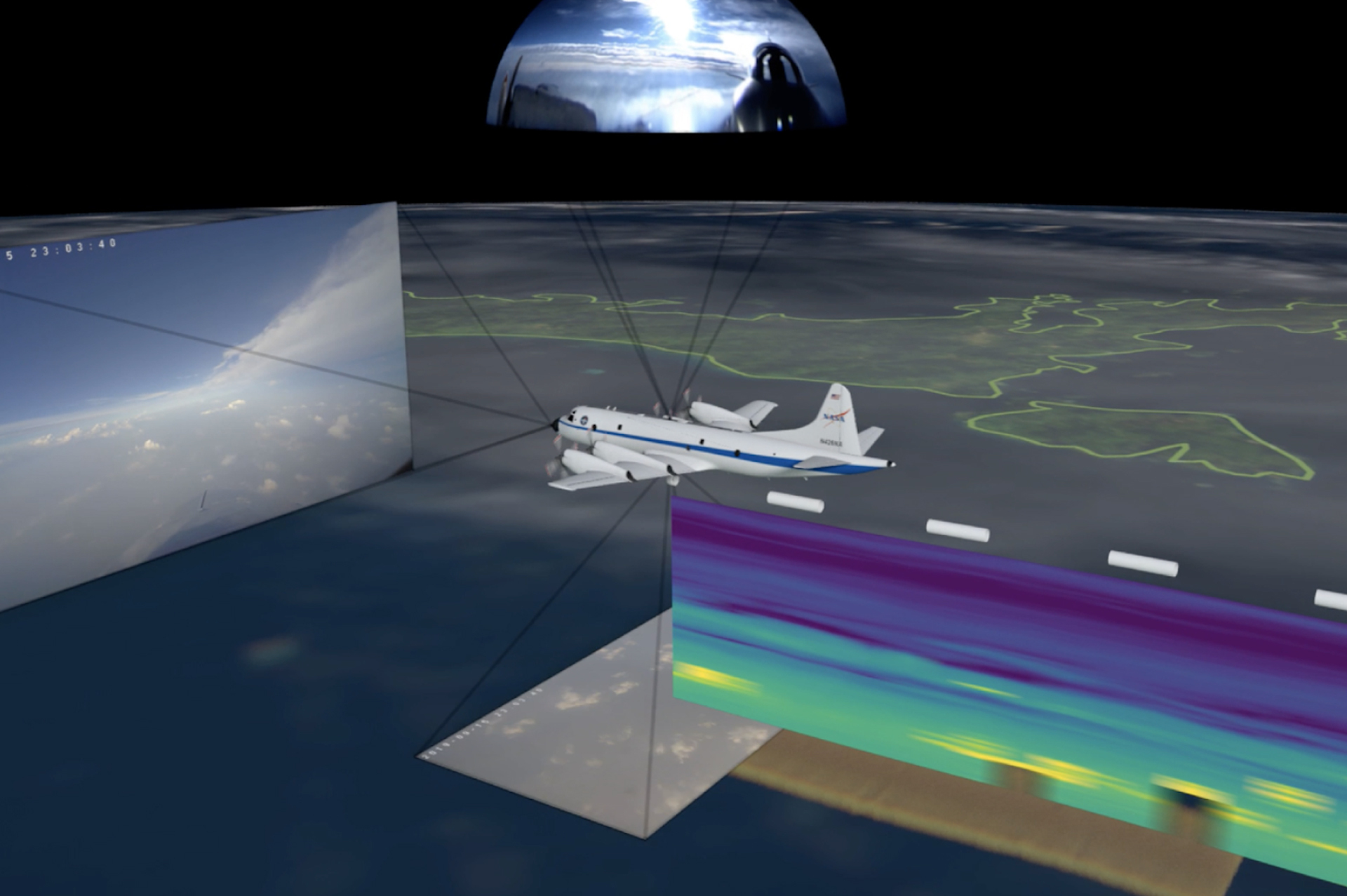
“This visualization was unlike anything AVL had done before. It’s typical for us to include 2-5 data variables in a visualization. Here, the 3D corner of the dashboard alone shows a couple of dozen variables! The whole dashboard, with its 3D and 2D components, shows 76. This was a very interesting design and science communication challenge.” – Kalina Borkiewicz, NCSA AVL Director
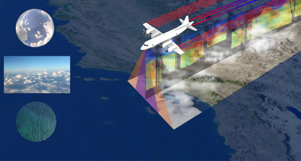
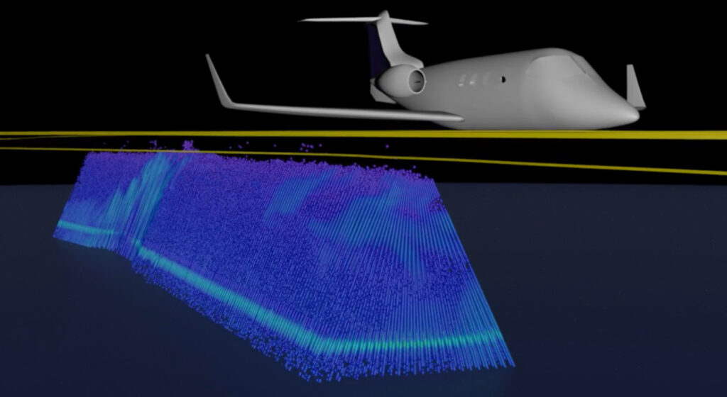
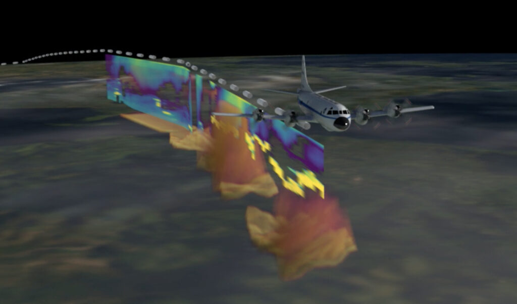
Leveraging AVL’s expertise with Di Girolamo’s atmospheric sciences knowledge, the team processed thousands of files from NASA’s CAMP2Ex campaign – a recent field expedition gathering information on the effects of aerosols on clouds, precipitation and climate in the Phillippines. The team used commercial, open-source and home-grown software to transform CAMP2Ex’s raw data into a 3D animation and data video dashboard.
Credit NCSA Advanced Visualization Lab, University of Illinois Urbana-Champaign, NASA
“Larry’s been an excellent guide and advocate for AVL, recognizing an unmet need and what we could do to address it,” says Stuart Levy, AVL senior research programmer. “It’s been great fun working with Larry’s research group, who’ve been very helpful in explaining CAMP2Ex data to us. It was delightful to hear CAMP2Ex’s global research team respond to our prototype – they were really enthusiastic!”
By presenting coordinated views of data collected by many instruments, these two visualizations allow researchers to explore the impact of air pollution on rainfall and weather in more depth than any one instrument’s data could reveal alone.
However, creating accessible visualizations that communicate complex Earth-science data wasn’t easy.
“The wide variety of data variables gathered by the onboard instruments vying for screen space proved to be a design challenge,” says Jeff Carpenter, AVL visualization designer.“ We solved it by trying several different layouts in Photoshop before replicating it in the final Nuke composite.”
The prototype features a three-minute 3D video depicting a NASA research aircraft navigating the open ocean and an extended data dashboard video presenting information gathered from air, sea and space.
Read more about this collaboration in NASA’s feature story here.