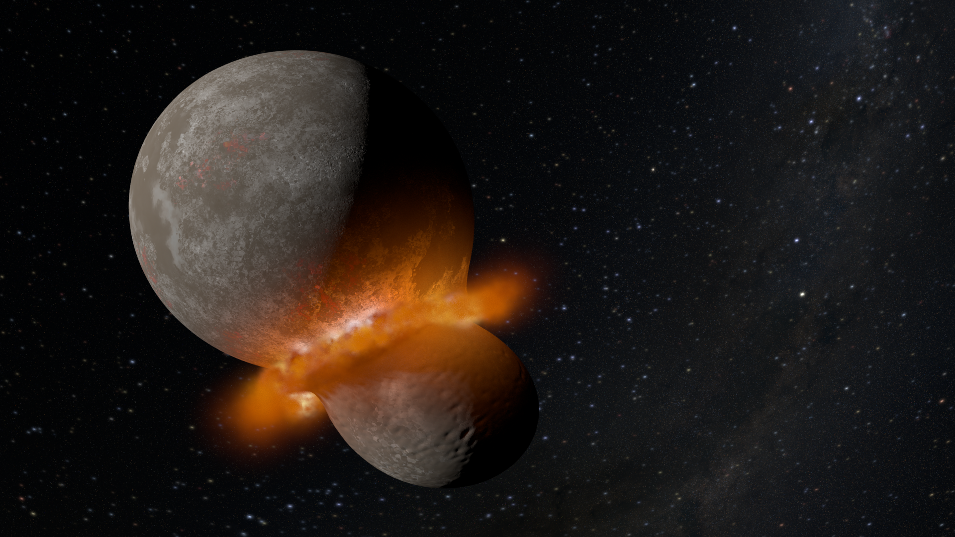
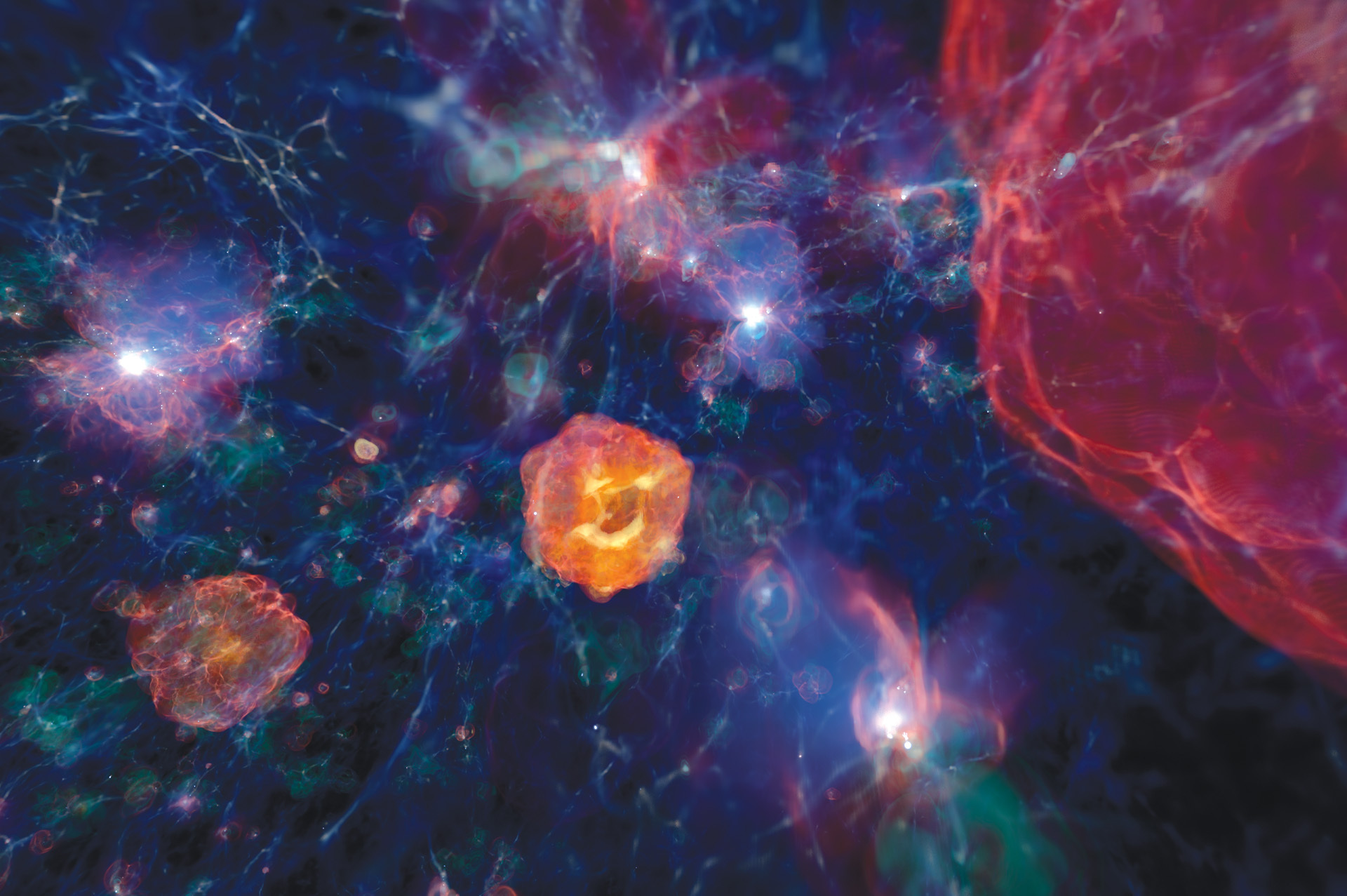
Visualizations are quickly emerging as one of the more effective ways to communicate scientific discoveries to broad, diverse audiences. Not everyone is as conversant in the science of a particular piece of research as those on the team that worked on it. Visualizations can bridge the knowledge gap between researchers and a large audience of mixed backgrounds. Without visual aids to contextualize the enormous size of giant black holes, for example, it’s difficult for audiences who aren’t astronomers to conceptualize how large celestial objects are. But sometimes even the scientific illustration or visualization can be confusing or unclear to audiences.
Kalina Borkiewicz has been leading NCSA’s Advanced Visualization Lab since 2021, and was a member of the team since 2014. Her team is always actively trying to improve their methodology for creating visualizations. They have published on the balancing act between creating visualizations that are accurate and those that appeal to broader audiences. A great deal of information is packed into a visualization, and deciding between what needs to be illustrated and what doesn’t sometimes requires testing. How do you create something instantly understandable without losing the wow factor?
“AVL visualizations are shown all around the world,” Borkiewicz says. “which means we need to be creating pieces that can be understood and appreciated by people of all ages, from a wide range of nationalities, educational backgrounds, abilities and so on. The only way to know if you’re really communicating what you think you’re communicating, is by getting feedback from real audiences, so that is the unique work we have been doing.”
While the main goal of a visualization is to convey complex information to viewers, that’s not the only thing Borkiewicz’s team considers when creating them. Visualizations should also immerse your audience in the data. When showing how a planet is born, the visualization should transport the viewer into space, giving them an intimate view of something amazing unfolding. By creating a cinematic presentation of data, Borkiewicz’s team attracts a much broader audience, often reaching millions of viewers.
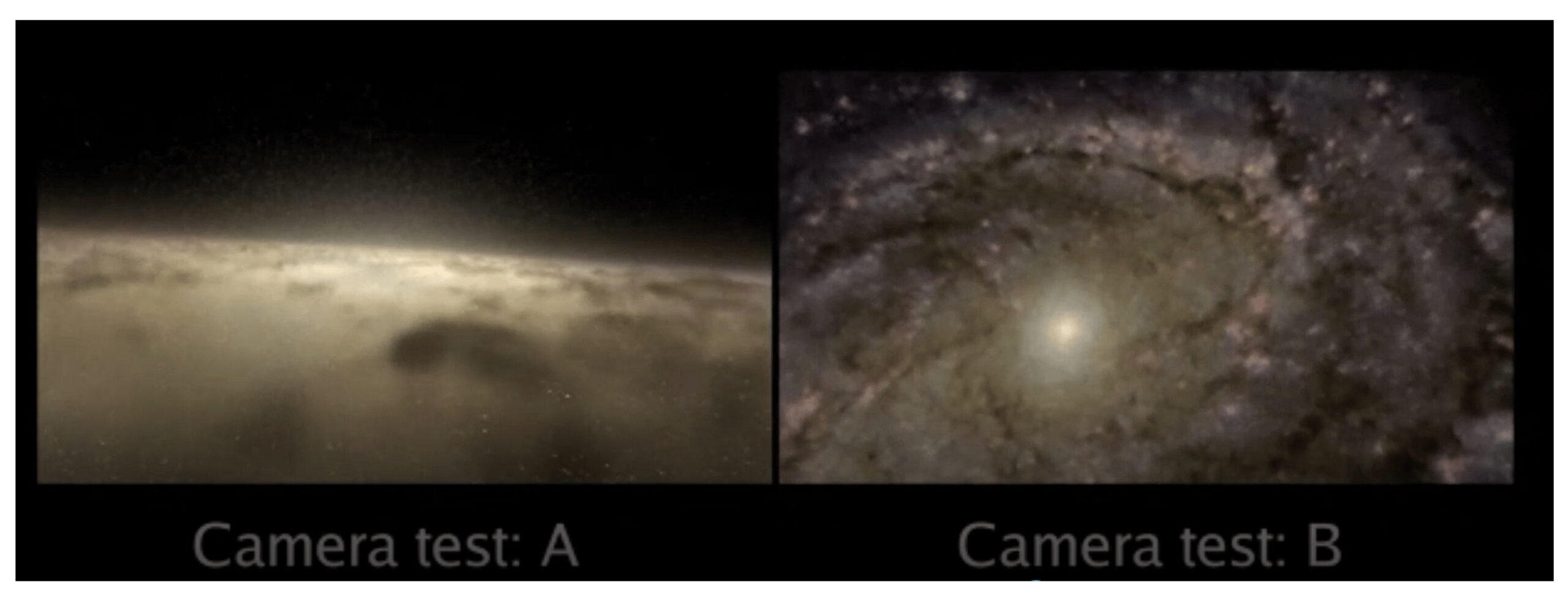
Labels and words on the screen can detract from the experience, so it’s important to use them sparingly and only when necessary. In order to determine how best to deploy additional text information to a visualization, Borkiewicz’s team has been adapting evidence-based methodology. Put more simply, the team identifies sections of a visualization that are attempting to communicate a tricky concept and they perform audience testing to see what works best.
“The field of cinematic scientific visualization is still in its infancy,” Borkiewicz explains. “We base a lot of our design decisions on research in well-established, related fields like information visualization. However, visualizing a scientifically accurate bar chart is different from visualizing a scientifically accurate galaxy, so the rules don’t necessarily translate perfectly. We are just starting to research best practices for cinematic scientific visualization, and we have to start by asking the basic questions – such as the effectiveness of labels. It’s well-known that labels are an absolute necessity for scatter plots and pie charts, but do they help audiences with understanding supernovae or solar storms? Or do they distract from the emotional, visceral experience of flying through the Universe?”
In their recently published paper titled, Evidence-Based Methods of Communicating Science to the Public through Data Visualization, Borkiewicz’s team explains their methodology when performing these audience tests. The team starts by researching best practices in visualization creation. They take the time to read up on current trends and collaborate with science communicators to design a test that will hopefully improve a visualization, making it both accessible and more understandable.
Once they’ve determined which parts of a visualization they want to test, they bring in an audience of viewers and show them various versions of the same visualization, some with informational labels, others without. The team then gauges the audience’s receptiveness to these changes through a survey afterward. The survey asks about the general favorability of the visualization but also asks specifically about the labels, if they remember them, did they make the science clearer, etc.
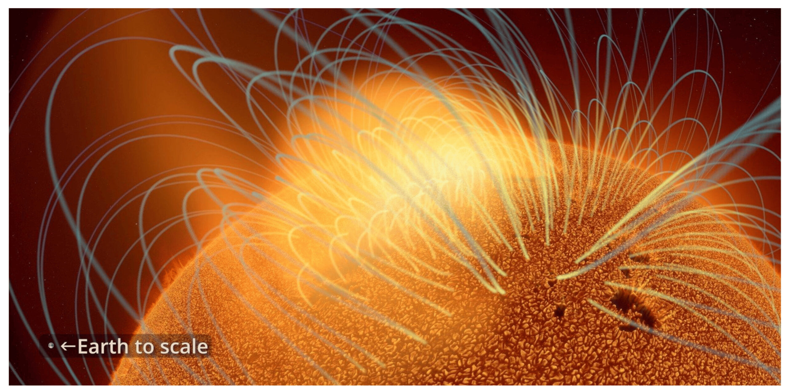
One thing that’s notoriously difficult to convey in astronomical visualization is the concept of scale. People don’t have a good sense for what ‘1 lightyear’ or ‘5 trillion miles’ really means. In one of our visualization tests, rather than throwing out large numbers, we tried comparing the size of a feature on the sun to the size of Australia. We thought this would be a more understandable reference, but it only confused people more. Many people gave us feedback asking, ‘why Australia?’. They were paying more attention to the scale reference than to the actual content of the video.
Kalina Borkiewicz, assistant director of visualization, NCSA
Some of their tests even change the direction of the visualization, with audiences choosing their favorite camera path or color palette. No matter how the audience responds, however, Borkiewicz’s team walks away with a better understanding of how to communicate science.
This evidence-based methodology is important as the field of scientific visualization continues to grow and evolve. An audience that’s engaged and invested in science is more likely to think positively about the pursuit of science. The sharing of knowledge is an essential component of research, and understanding is the other half of that process. When the public is aware of and understands why science is important, support for research increases. It’s in the interest of all researchers to make science broadly accessible, and visualizations are a major contributor to the dissemination of knowledge.
This research, funded by The Brinson Foundation, is the first of its kind on using evidence-based methodology for cinematic scientific visualization. The project has been a great success and the AVL team plans to continue incorporating such research into it’s visualization projects with hopes of paving the way for future visualization researchers and practitioners.